Monday, October 27, 2014
Second Portrait
Valerie, walking back to the E-wing
Edits: changed aspect ratio by cropping, minimized brightness of sidewalk
Tuesday, October 21, 2014
Lens - Three Rules of Composition
I chose photo 8 because it demonstrates simplicity. The subject of the picture is rather ordinary, just a ramshackle house. Because of the dramatic effect of the simplicity of the photo, the subject matter is easily grasped by the viewer. Additionally, this photo shows depth. In the background of the picture, one can see all the other houses, of similar design to the one of focus. This shows a repetitive parallel of sorts. The photo also displays a well developed aspect ratio. The photo contains just the necessary details, with nothing more.
Friday, October 17, 2014
First Portrait
Conversation
Haroon, fondling the plants by the benches by the snack bar.
Edits: Increased exposure. Minimized brightness of bench. Increased color saturation.
Haroon, fondling the plants by the benches by the snack bar.
Edits: Increased exposure. Minimized brightness of bench. Increased color saturation.
Friday, October 10, 2014
Thursday, October 9, 2014
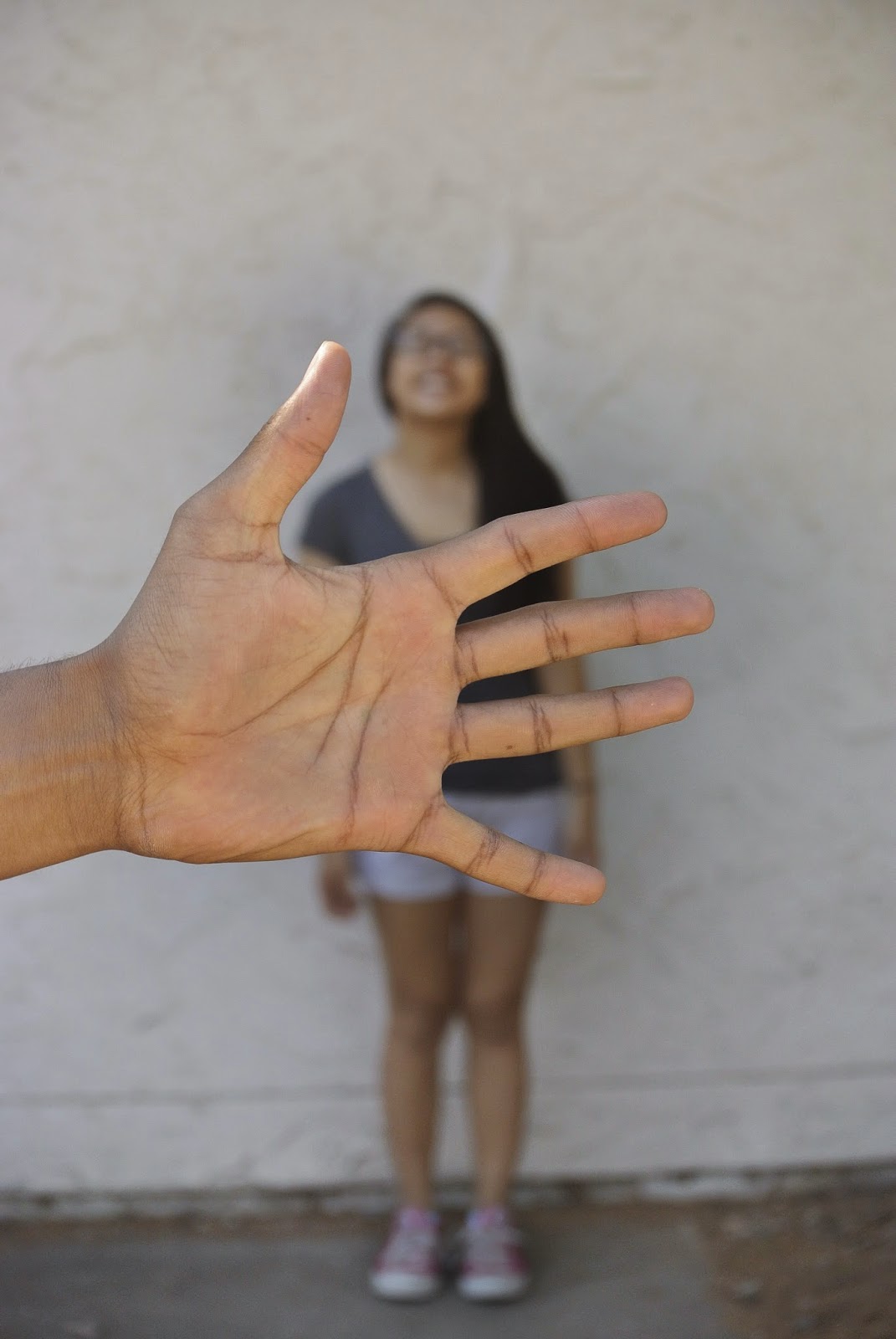
Shallow Depth of Field
Use of the shallow depth of field allows the viewer to focus entirely on the subject of the photograph. The subject is in focus, and the background is blurred.
Edits: Intensified the focus on the hand and minimized the brightness of the hot pink shoes
Subscribe to:
Comments (Atom)


