2. Photo 8 is the best photograph from this slideshow. The crispness of the splash intensifies the blurriness of the swimmers, thus allowing the eye to travel through the picture naturally. The photograph was shot from an overhead angle, an angle from which spectators would not usually view synchronized swimming. The vibrant blue of the pool is aesthetically appealing, and makes the image more memorable. When I clicked on this slideshow today, I remembered the photograph of the synchronized swimmers before I saw it again, though the last time I saw it was several month ago.
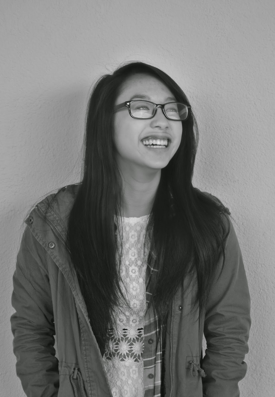
3. My best work this semester was definitely during the Masters of Photography project. This project demonstrated my progression in the field of photography. It also showed how much I have yet to learn from the many wonderful photographer who were honored in the International Photography Hall of Fame. Of the photographs that I took for this assignment, the best ones I shot were definitely the laughing ones of my group members. The emotion they felt when the picture was taken is clearly visible through their expression. By studying Karsh's photographs, I discovered that the true way to take a beautiful portrait is to make a connection with the subject, so as to yield some emotion during the photo shoot. To improve this project, I would try to extend the photo shoot outside my group members. This would test my skills, and I would discover how to take a good portrait of any subject.
4. My three rules of photography are simplify, aspect ratio, and depth. In September, I took photographs that portray each rule: simplify, aspect ratio, and depth.
5. This photograph of Haroon Adam Rasheed best depicts my rules of composition. The image is simple, a black and white image with a white background. It represents aspect ratio because of the cropping.
 |
7. I love working with my Digital Photography group. I found many advantages to working in a group.
-Working together improved our comprehension of the assignment
-Working in a supportive environment nurtured our photography skills, both individually and as a group
-We used our collective strengths to support (and eliminate) our weaknesses in the field of photography
-We discovered fresh, new ways to exhibit our photographs by listening to the opinions of our group members and using their perspective to see the photo in a different way.
-With each new project we have, we learn more about each other and photography skills, and we become stronger as a group.
8. However, group work can have some downsides.
-We occasionally clashed because of our differences in opinions
-It takes more time to effectively communicate as a group than it would to complete the project alone.
-The activity often requires a group.
-You often have to compromise, and neglect your personal choice to allow the group to come to a consensus
-Each member had his/her individual talent. It was difficult to share some of the tasks
9. Haroon Adam Rasheed's portrait of Kaitlyn Shih was my favorite. It was taken during one of our many Yousuf Karsh photo shoots. It is the last photograph in this series.
10. We studied Yousef Karsh. He advanced and developed the use of lighting in portrait photography. He known as a master of lighting and portrait photography and developed and advanced both facets of photography.
12. The founder of LIFE magazine was John Ames Mitchell, a 37-year-old illustrator. It began publishing as a photo-journalism magazine in 1936.
13. Robert Capa was the founding member of Magnum Photos. It was founded in 1947.
14. Capa photographed "The Falling Soldier" on September 5, 1936 at Cerro Muraino.